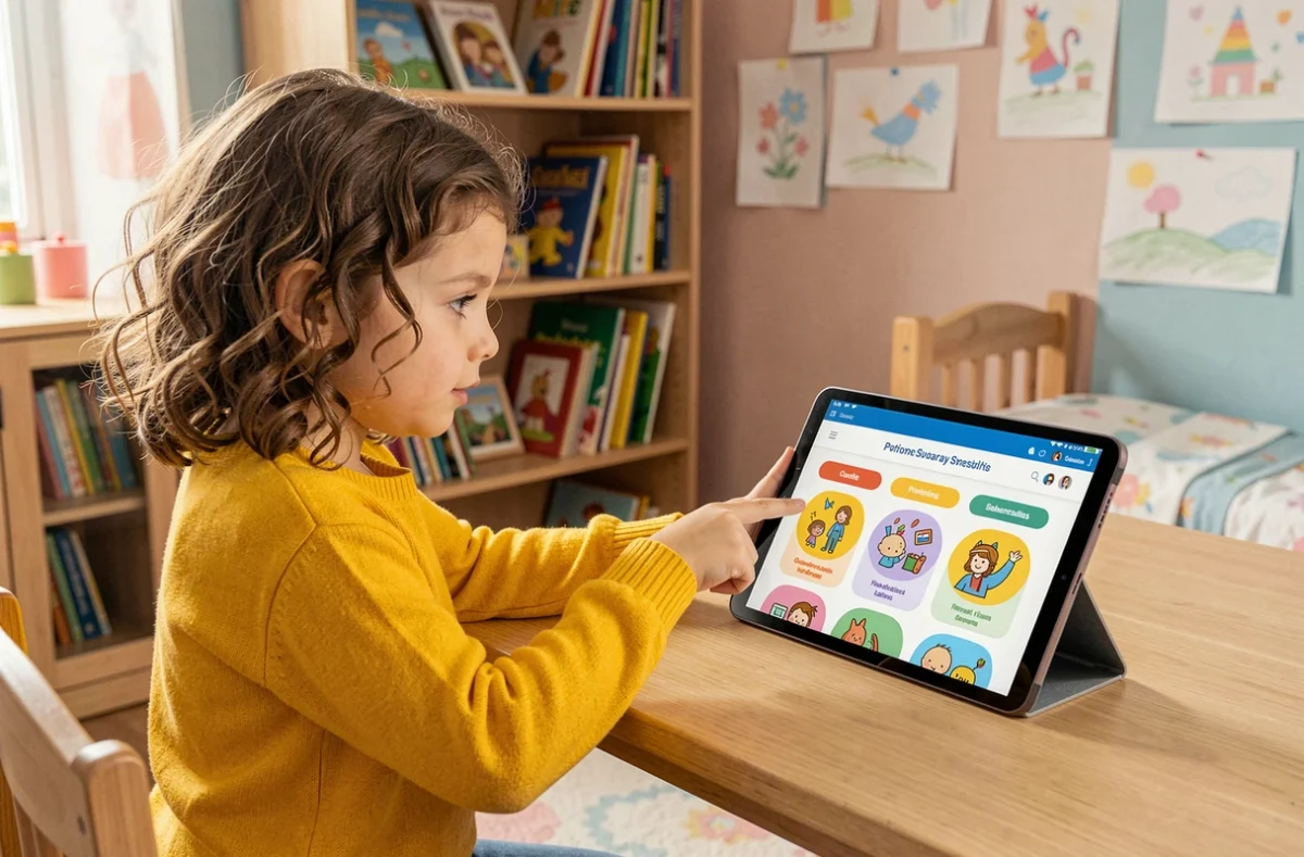
A seven-year-old opens an educational website for the first time. They’re looking for a coloring page, come across a “Music” section, click at random, land on a reading page, then close the tab. The problem isn’t the content, but the user journey: the navigation cues don’t match the way they think.
Menus and icons on a children’s website: what gets in the way of navigation
On most children’s websites, the main menu follows an adult’s logic: abstract labels (“Teaching Resources,” “Discovery Zone,” “Multimedia”) grouped in a horizontal bar. A child who has only recently started reading can’t make sense of these categories.
The first obstacle is vocabulary. Words like “section” or “category” aren’t part of the everyday vocabulary of a six- to nine-year-old. Concrete labels like “Games,” “Videos” or “Stories” work better because they directly describe what the child wants to do.
The second obstacle is menu depth. When it takes three clicks to reach some content, young users lose track. The best-designed sites limit navigation to two levels: a main section, followed by a subsection identified by an icon or color.
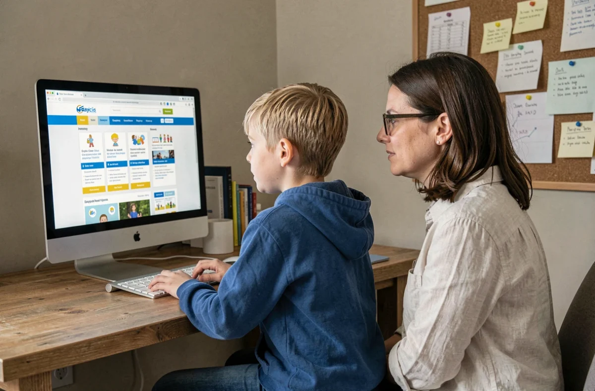
To see all the available pages without browsing through each section, the Kidits sitemap provides an overview that helps parents and children find the resource they’re looking for directly.
Age-appropriate visual cues: colors, icons and ways back
Children rely more on visual memory than on reading to find their way around. Assigning a color to each main section (green for games, blue for videos, orange for education) creates a consistent cue from one page to the next.
Icons serve the same purpose as road signs. A pencil for drawing, an open book for reading, a musical note for nursery rhymes: an icon can replace a word when a child isn’t yet a confident reader.
A “Back to home” button that’s always visible
We often underestimate how stressful it can be for a child who doesn’t know how to go back. A fixed “Home” button, always in the same place (the top-left corner, for example), with a house icon, gives them a reliable way back.
This button should remain visible even at the bottom of the page. On mobile, where children are increasingly using websites, a fixed menu at the bottom of the screen with three or four large icons makes touch navigation easier. Little fingers often miss click targets that are too small.
Navigation by age or activity: which structure should you choose for an educational website?
Children’s needs vary depending on whether they’re five or eleven. A site with just one entry point mixes content that’s too simple and too complex on the same page, discouraging both groups.
Dividing content by age group (3–5, 6–8, 9–12) makes it easier to find your way from the home page. The child (or parent) chooses an age group, and the sections displayed match their reading level and interests.
When organizing by activity works better
For a site focused on a specific type of content (online games, educational videos), sorting by activity is more intuitive. Children know what they want to do before they know which level is right for them. These are the sections most commonly found on well-organized sites:
- Games and quizzes: interactive activities grouped by topic (animals, science, geography) rather than difficulty, so children don’t have to assess their own abilities before they even begin
- Videos and cartoons: grouped using large thumbnails, each showing an image from the content and its duration so children know what to expect
- Crafts and coloring pages: downloadable or printable files, available without signing up, with a preview visible before clicking
- Stories and reading: grouped by estimated reading time (short, medium, long) rather than school grade, which is a more meaningful guide for children
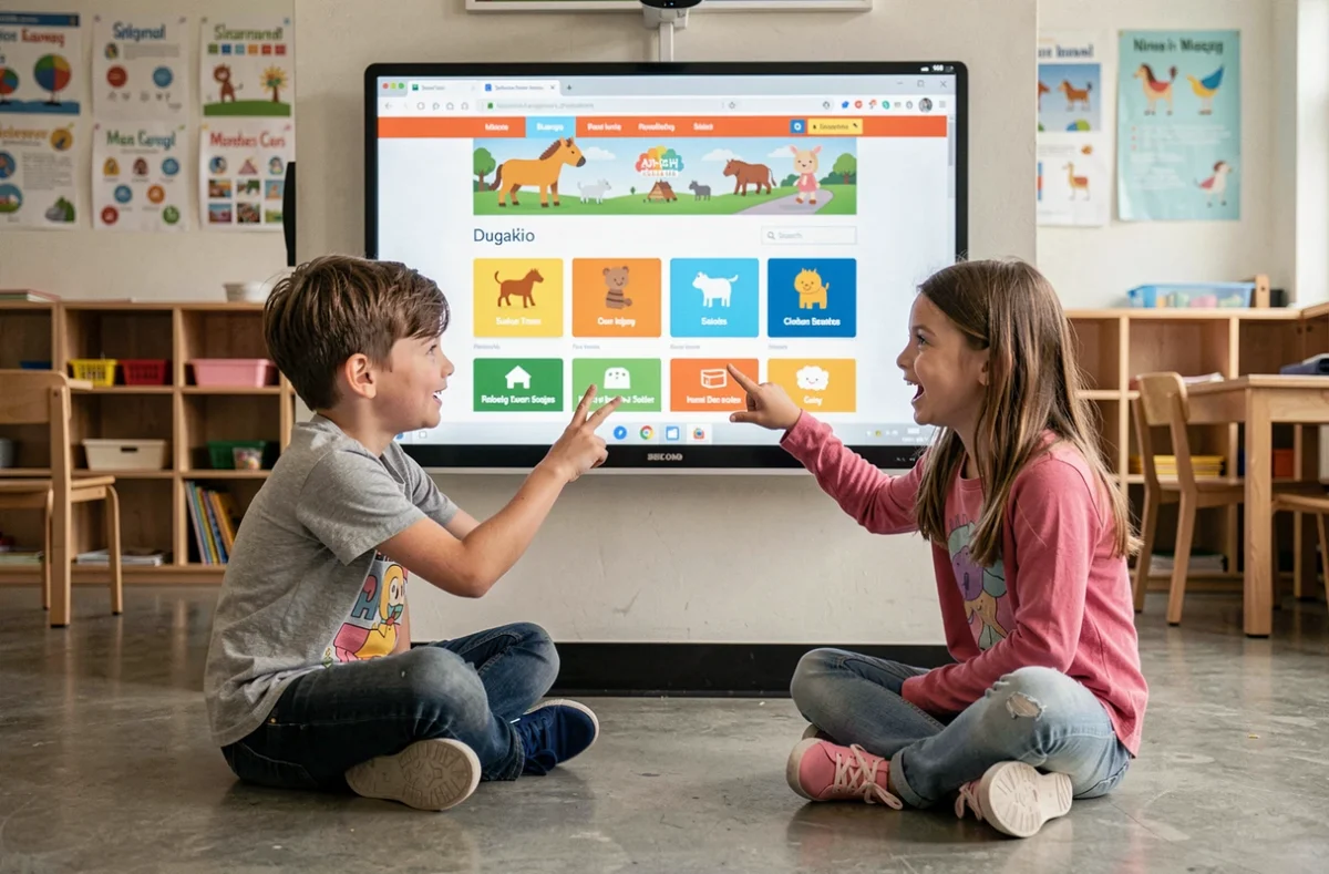
Support needs differ greatly between young children and teenagers. A one-size-fits-all “children’s” navigation doesn’t work: adapting the cues to each age group remains the only realistic approach.
Search bars on children’s websites: how they work and their limitations
A search bar may seem like a universal solution, but it presents a specific challenge for young users: a child who types “dinosaur coloring page” expects an immediate result, not a list of ten links.
The most effective sites for this audience display results as visual cards (image, short title, action button) rather than as a text list. Each card shows what the content looks like.
Tolerance for typos
A seven-year-old might type “dinosar” or “coloring paje.” If the search bar can’t handle these approximations, it returns nothing, and the child concludes that the content doesn’t exist. Autocomplete and spell-check features built into the site’s search engine can transform the experience.
You can also offer visual suggestions below the search bar: popular keywords displayed as clickable bubbles (“Animals,” “Space,” “Music”) that let children skip typing.
Parental guidance and reporting: two sections to make easy to find
A clearly labeled space for parents (parental controls, information about the content on offer, privacy policy) reassures families. This section shouldn’t clutter the child’s navigation: place it in a secondary menu, accessible through a discreet but permanent link, often in the footer.
The report button (for inappropriate content, bugs or technical issues) should be accessible without leaving the current page. A visible exclamation mark icon on every page lets a child or parent report an issue right away.
- Parents’ area: accessible from the footer or via a simple password, separate from the child’s navigation
- Report button: available on every content page, not just the home page
- Help or FAQ page: written in short sentences and illustrated with screenshots to guide children who get lost
A well-organized children’s website is about more than a pretty design. What matters is how easy the journey is to follow: words children understand, colors that stay consistent, a back button that’s always in the same place, and a search function that forgives spelling mistakes. The most reliable test is to put a child in front of the screen and watch where they click first.